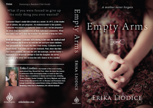
One of the best things about owning my own publishing company is that it puts me in full creative control of my book covers. One of the scariest things about it? It puts me in full creative control of my book covers.
Considering that a novel can take years to write, it’s easy to forget that your cover is just as important as the story inside, especially during those few seconds when a reader picks up (or clicks on) your book to decide if it’s worth buying. I’m sure I’ve overlooked hundreds of great books because I didn’t like their covers. And I’ve purchased more than a few mediocre books because the cover was too beautiful to resist. Naturally, our goal as writers is to produce a book that is a masterpiece both inside and out, but it’s a tragedy when a book’s inner beauty is overlooked because of an inferior cover.
Since publishing Empty Arms, many people have complimented me on my book cover and a handful have even asked for design advice. While I’m so grateful that my cover resonates with readers, I have to admit that it wasn’t all luck. I spent a lot of time deconstructing book covers, developing a creative brief to verbalize my vision, and hiring the right graphic designer to execute it. Since more and more writers are becoming author-preneurs, I thought it might be helpful to share the design process that resulted in a cover I’m extremely proud of.
Step 1: Hunt for inspiration.
In order to get inspiration for my own cover, I visited my local book store and picked up every book that had a cover that appealed to me. I found a comfortable seat in the store and studied each cover, deconstructing them to understand why they jumped out at me. Was it the title? The colors? The typography? What I discovered is that I am drawn to books that have a “soul-stirring” photo on the front. And for an emotional book like Empty Arms, that seemed appropriate.
Step 2: Scout images.
There are a number of stock photography sites that offer a wealth of compelling photograps and illustrations. Some that I’ve browsed are: Corbis, Getty Images, Shutterstock, and iStockphoto. When choosing an image, be sure to check if it’s rights-managed or royalty-free. A “rights-managed” image means that the price you pay will be based on how the image will be used (think beyond your book cover to your marketing materials, website, etc.) and how many copies of the book you plan to sell. While rights-managed photos can be expensive, the upside is that they are often better quality and more highly stylized than their royalty-free counterparts. Some even allow you to purchase an exclusive license so your image doesn’t end up on someone else’s book. A “royalty-free” photo is generally cheaper because it’s priced based on the size you purchase, not how it’s used or how many times it’s reproduced.
Another option to consider is hiring a photographer to capture the shot you want. This option involves a little more legwork because you may have to hire a model and organize a photo shoot, but you will be able to set up the exact shot you want AND you can negotiate exclusive rights to your photo. This was the option I chose and I was surprised to discover that hiring a photographer and model was actually cheaper than buying the photograph I wanted.
While it may be tempting to opt for the cheapest route, just remember how much readers rely on your cover when deciding if your book is right for them.
Step 3: Plan your design.
Designing a book cover is kind of like putting on makeup, you should highlight one feature and be subtle with the rest. The same is true of book covers. You don’t want your amazing photograph competiting with a zany font nor do you want a clever type treatment lost against a busy photograph. Here is an example of a book cover that uses an image as the focal point while keeping the typeface simple and clean:
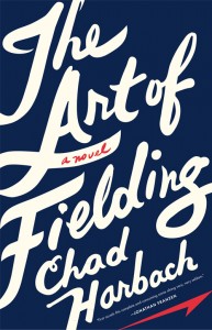
And here is an example of an artistic type treatment taking center stage:
See what I mean? Independently, the image from Firefly Lane and the typography from The Art of Fielding work beautifully, but together they would be distracting.
Step 4: Prioritize your information.
Here’s the question that many authors ponder during the design process: Which should come first, my name or the title?
During my deconstruction, I noticed that some covers feature the author’s name at the top while others place the title there. Which is right? Technically, they both are. Since we read from top to bottom, the upper half of the book cover is where you should put the most important information – for me, that’s the title. If I were a brand name author, like Jodi Picoult, Danielle Steel, James Patterson, or Stephen King, then my name would be more important than the title (notice below how their names generally appear at the tops of their book covers). Until then, my title has a better chance of capturing readers’ interest, so it goes on top.
Step 5: Develop a creative brief.
When I worked in advertising, we used a “creative brief” to provide the art director and copywriter with specific details about the project to ensure that everyone was on the same page. When it came to designing my book cover, I took that concept and tailored it to my project in order to provide clear direction to my designer. Many authors visualize their book cover during the writing process – I know I did – but graphic designers aren’t mind readers, so it’s important that you clearly communicate your vision. On the flipside, if you don’t have a cover concept in mind, give your designer plenty of information about the book so he or she can create a design that fits your book’s theme and tone.
You can download my instructional creative brief here: Creative Brief for Book Cover
Step 6: Hire the right designer.
Even though I know my way around Photoshop and Illustrator, I felt that my book cover was a project best left to the pros. Considering the hoards of talented advertising pros out of work right now, I decided to advertise the job on Craigslist. I received dozens of resumes and portfolios from many talented individuals. I interviewed those whose work caught my eye and learned as much as I could about their design and review process (and what would happen if I didn’t like their work). Within a few weeks, I hired my designer, gave him my creative brief, and we were on our way to developing a book cover that I love.
Step 7: Get feedback.
Before signing off on your favorite book cover concept, ask your friends and family members to weigh in. While it’s okay to show the designs to a mix of people, you should give more weight to the opinions expressed by those who would actually be considered part of your target audience. It would be a shame for you to reject a great design based on the advice of someone who doesn’t even read your genre.
Photo credit: all cover images courtesy of B&N.com.
—
Do you have a question about my writing process?
I’d be happy to answer it on my blog, just e-mail me: [email protected]


I love this! I have had the idea in mind for my novel since I started the first chapter. I can’t wait to finally do it.
Hi Ashley,
I know what you mean…I could picture the Empty Arms cover the entire time I was writing it. It’s so exciting to see that vision come to life. Good luck with yours; I can’t wait to see it!
Erika
This is a great post. I’m saving it for future reference. And I’m plastering it all over the place.
Karen,
I’m glad you found this information helpful and are sharing it with other writers!
Erika
Erika, I love your cover and I love this post. I think it’s so important for writers, especially those self-publishing to study what goes into a cover.
Stacy,
Thank you and thank you.
I agree…when you publish a book (especially if you are self-published), the cover is critical. It’s not just about pretty pictures and scrolly fonts but communicating what your story is about…visually. Glad you found this post helpful!
Erika
I saw this and couldn’t believe it. As i was writting book i couldn’t stop worring about what i would do for my book cover, I was so unset. Now that I saw this post I can take a breather, and focus on what my book cover with look like.
Thank you!
Hi! My Name is Tamara and I’m 11 years old. I’m writing a book called The Schoolyard Battlefield:0 I know I’m young, but I got a high distinction in writing at school and I bet the book will be a big hit! It’s about Bullying in real life, but exagerated. I’m up to Chapter three but I wanted to know how I would make the dustjacket?
Please reply…
From Tamara